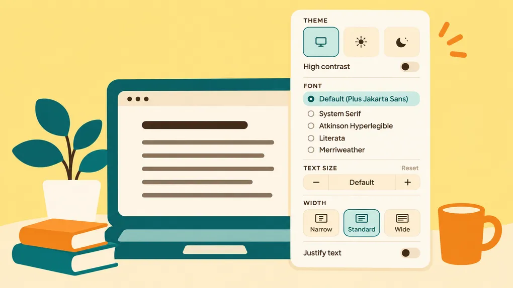

Everyone has their own idea of what makes reading comfortable. Some prefer the familiar look of a serif font, while others find sans-serif text easier to follow. Some enjoy narrow columns that feel like a book, while others want to make better use of a wide screen.
Bredbox already gives you a quiet place to read saved content without the distractions of the original website. Now, with new customizable display settings, you can make that reading experience your own. Whether you’re reading an article, catching up on a newsletter, or following a recipe, you can adjust the typography and layout to suit your preferences.
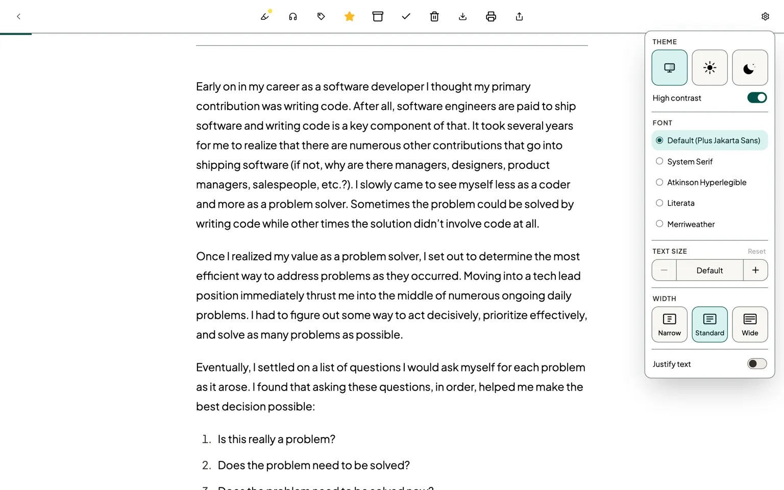
To get started, open any saved article, newsletter, or recipe in the Bredbox web app and click the gear icon in the upper-right corner of the reader toolbar.
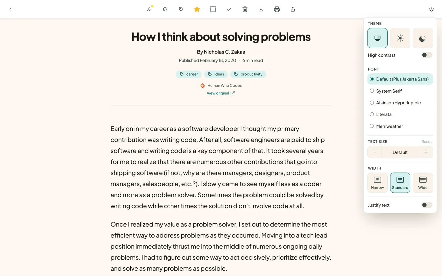
Choose a font that feels right
Bredbox now offers five reading fonts, each with a different character:
- Default (Plus Jakarta Sans): The familiar, modern font Bredbox has always used.
- System Serif: A serif typeface that follows your device’s default.
- Atkinson Hyperlegible: A font designed with accessibility in mind, using distinctive letterforms to make individual characters easier to tell apart.
- Literata: A serif font designed specifically for extended digital reading.
- Merriweather: A serif font designed to be comfortable and readable on screens.
If you enjoy the feel of reading a book, you might prefer Literata or Merriweather. If you have difficulty distinguishing certain letters or numbers, Atkinson Hyperlegible is worth trying. And if you’re already happy with the existing Bredbox appearance, you can keep the default.
Switching between fonts is easy, so you can experiment until you find the one that suits you.
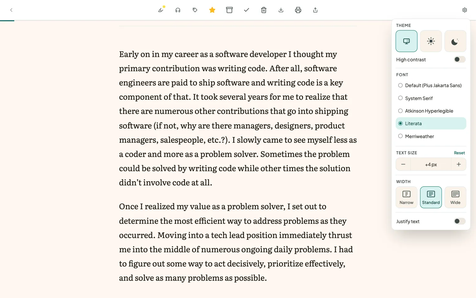
Make the text larger
Sometimes the simplest adjustment makes the biggest difference. Whether you’re reading on a high-resolution monitor, sitting a little farther from your screen, or simply prefer larger text, you can now increase the font size without relying on browser zoom.
Bredbox offers seven increases above the default text size, with each step adding two pixels. You can adjust the size using the controls in the display settings menu and return to the original size with a single click.
For readers who prefer the keyboard, we’ve also added a few shortcuts:
=increases the text size.-decreases the text size.0resets the text to its default size.
These shortcuts work while you’re reading, without interfering with typing into text fields or using other controls.
Find your ideal reading width
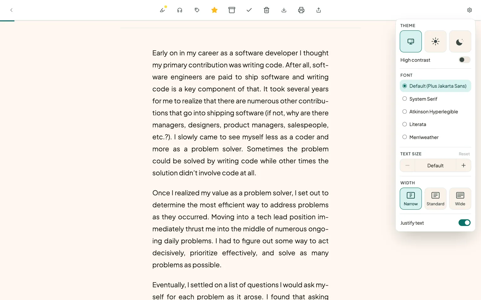
Line length can make a surprising difference to the way reading feels. Long lines let you see more text across a wide screen, while shorter lines can make it easier to follow your place as your eyes move from one line to the next.
You can now choose between three reading widths:
- Narrow: A more compact column for those who enjoy shorter lines.
- Standard: The familiar Bredbox layout.
- Wide: A broader column that makes more use of available screen space.
These options work across articles, newsletters, and recipes. Bredbox also keeps the layout within the available screen width, so choosing Wide won’t force you to scroll horizontally on a smaller screen.
For articles and newsletters, there’s an additional option to justify text, aligning paragraphs along both the left and right edges. If you prefer the appearance of a printed book or newspaper, you might enjoy this setting. It only affects ordinary paragraphs, leaving headings, lists, and other structured content alone.
Make reading clearer with High Contrast mode
Sometimes readability is about more than the font or the size of the text. The contrast between the text and its background can make a difference, especially when you’re reading for a long time or find subtle colors difficult to distinguish.
We’ve also added a High Contrast mode, available as a simple toggle in the same display settings panel. Turning it on gives you a higher-contrast reading appearance, making text and other visual elements easier to distinguish.
You can turn High Contrast mode on or off whenever you like, alongside your other display preferences. It’s another way to make your reading environment more comfortable without changing what you’re reading.
Your preferences follow you
Perhaps the most useful part of these changes is that you only need to make them once.
Your selected font, text size, reading width, and text alignment are saved to your Bredbox account. When you open another article, newsletter, or recipe in the web app, your preferred settings are already there. They also follow you when you sign in through another browser or device.
That means you can spend a few moments finding a reading experience you enjoy and then forget about the settings entirely. Bredbox will remember them for you.
Your existing System, Light, and Dark theme options are also available from the display settings menu, alongside the new High Contrast toggle, making it easy to adjust the appearance of the reader in one place.
These new customization options are currently available in the Bredbox web app. (The mobile apps and PDF viewer aren’t affected by this update.)
Your library, your reading experience
A personal reading library should feel personal. The things you save reflect your interests, your curiosity, and the subjects you want to spend time exploring. It makes sense that the experience of reading them should reflect your preferences, too.
These new settings are small adjustments individually, but together they make Bredbox a more flexible place to spend time with the content you’ve chosen to keep. Whether you’re settling in with a long essay, catching up on newsletters, or following a recipe in the kitchen, you can make the reading experience more comfortable for you.
Give the new display settings a try the next time you open something in Bredbox. Click the gear icon, experiment with the options, and find the combination that feels right.
After all, it’s your library. You should be able to read it your way.